01
Start with the patient's question
The opening screen asks which vision correction method might be right for the visitor, with one clear way to begin.
 Maksim Kotsar · websites for healthcare
Laser vision correction comes with a lot of questions. This English-language adaptation turns an existing clinic website into a clear, approachable journey from the first question to a consultation.
Explore the websiteAdapt a detailed vision correction website for an English-speaking audience while keeping the reassuring character and recognizable visual identity of the original.
Choosing eye surgery is personal. The experience needed to make complex information easier to navigate and address the questions a visitor may bring to the page.
Several procedures and unfamiliar terms can make the first decision feel overwhelming.
Visitors need a clear picture of the consultation, procedure and recovery.
The people, equipment and follow-up care should be easy to find.
The next step should stay visible when a visitor is ready to talk.
I mapped the page as a sequence of questions: what are my options, what happens, who will care for me, and how do I take the next step?
Illustrative layout studies reconstructed from the finished page.
The direction became clear: explain one decision at a time, give the medical team a human presence, and keep the next step easy to find.
A familiar visual language and a simpler reading path help visitors understand what the clinic offers before they decide to get in touch.
The opening screen asks which vision correction method might be right for the visitor, with one clear way to begin.
SMILE, flap-based LASIK and surface ablation are grouped together so the differences can be scanned without searching the page.
Before, during and after surgery are presented as separate stages, making the sequence easier to follow.
Specialist profiles, names and experience bring a human face to a medical decision. Equipment details remain available for those who want them.
A six-question experience helps visitors reflect on their vision. It points to a consultation rather than making a diagnosis.
The mobile version stacks information into readable sections, keeps touch targets generous and makes contact points easy to reach.
The site pairs clean medical photography with soft gray surfaces, generous white space and the clinic's recognizable teal.
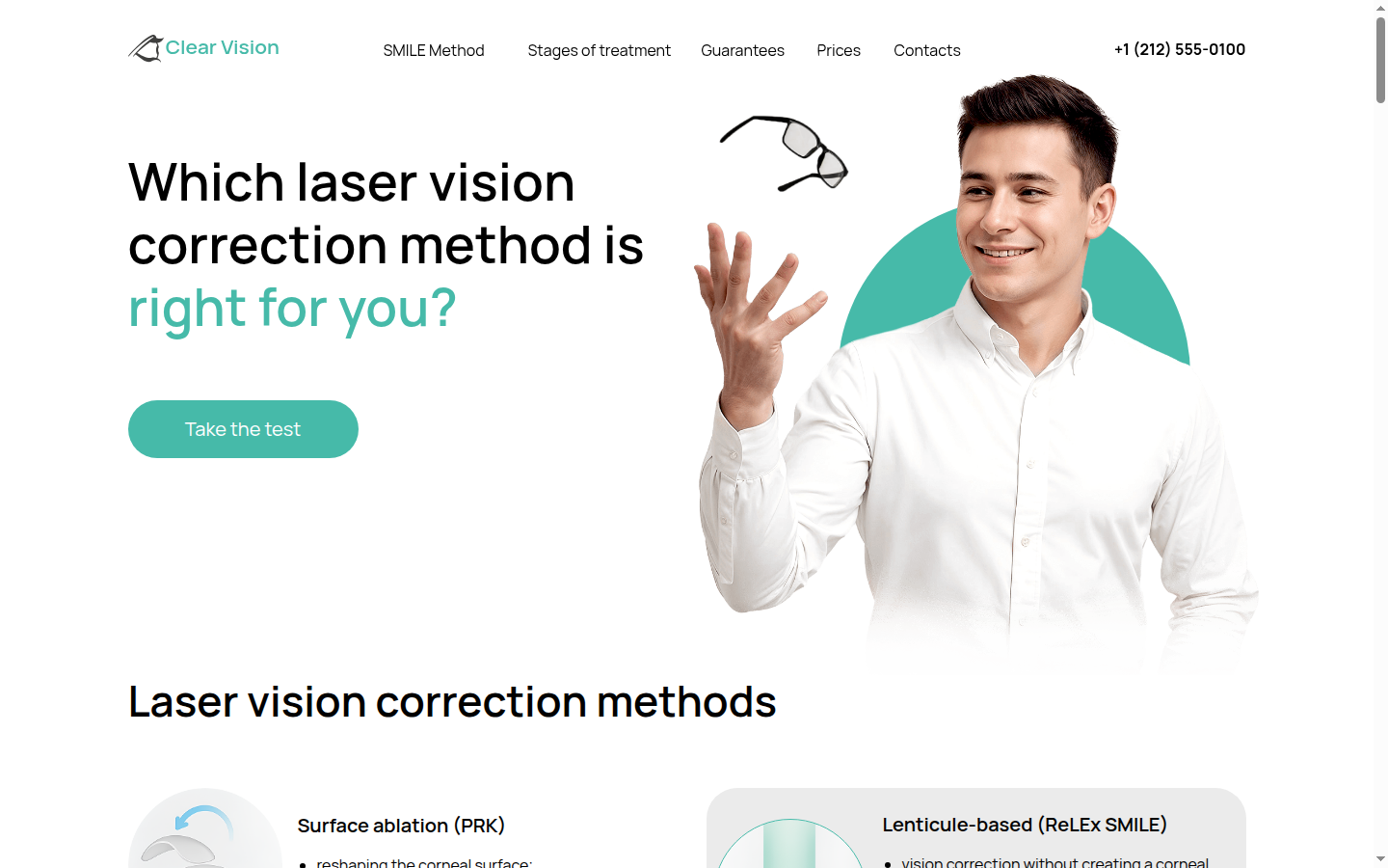
The headline turns an unfamiliar medical decision into a straightforward question. A single primary button invites visitors to explore their options.
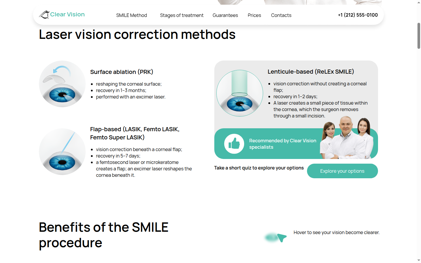
Illustrations and short descriptions organize the methods side by side, making a dense subject more approachable.
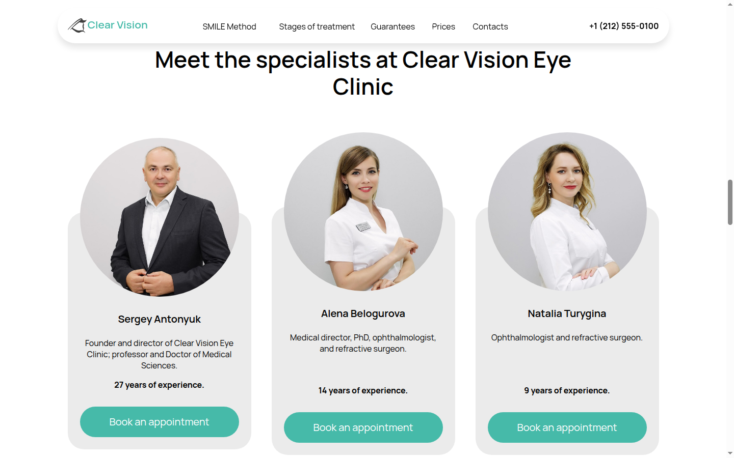
Portraits, roles and experience put the people behind the procedure in focus. Appointment buttons appear alongside each profile.
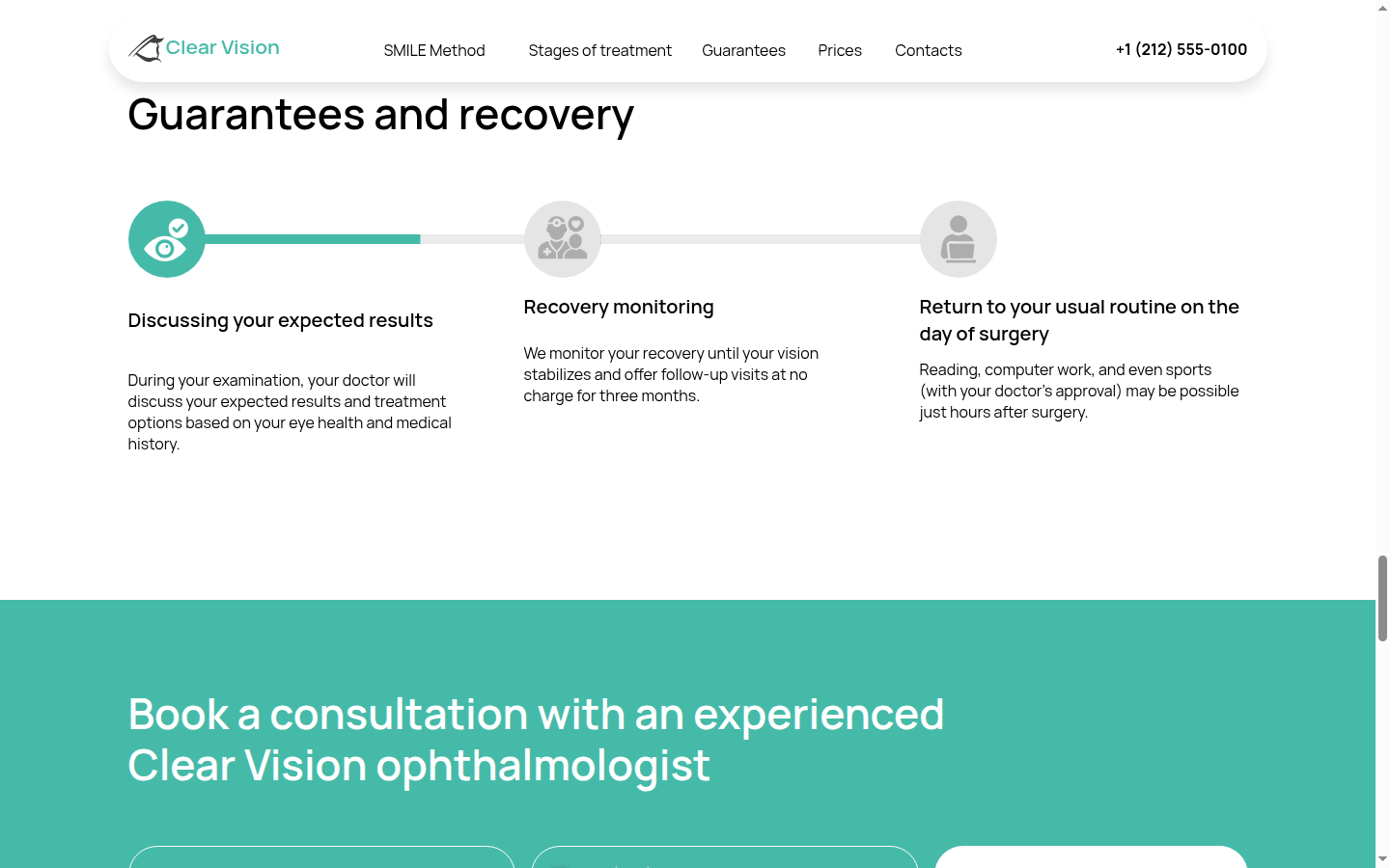
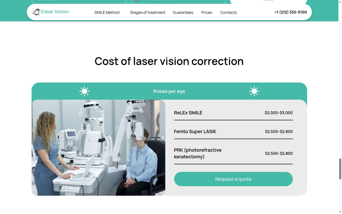
Recovery, equipment and pricing each have a place in the journey. The consultation form follows the information rather than interrupting it.
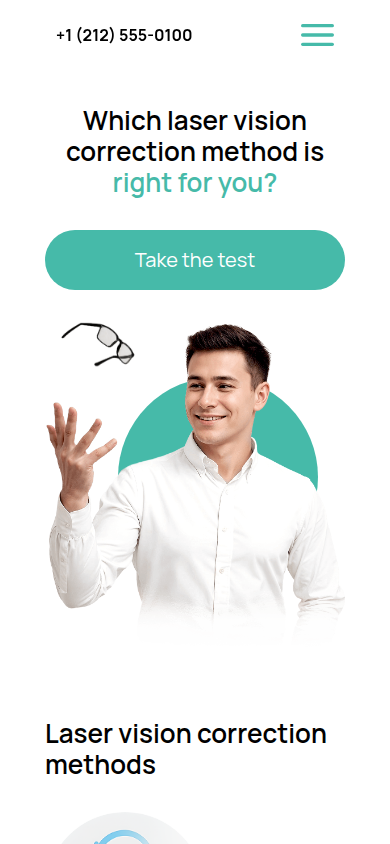
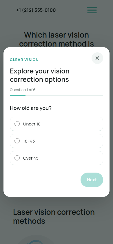
On mobile, sections stack naturally and the six-step quiz fits the screen. Buttons, text and navigation stay easy to use.
The result is an English-language concept that preserves the original clinic's design while making its content and key interactions accessible to a wider audience.
A Russian-language clinic website with a detailed treatment story and an existing visual identity.
A responsive English adaptation with a guided quiz, refreshed copy and a clearer path through the page.
Visitors can explore procedures, see the specialists and find the next step in one place.
Demo data: these numbers are fictional placeholders used to show the intended reporting format. They are not measured results.
A medical website has a lot to explain. The work here was to give that information a more natural order, without losing the character of the original.
This concept shows a direction for a patient-friendly experience. It is a portfolio demonstration; no client testimonial or performance result is claimed.

I'll review your website and share three ideas to make the patient journey clearer.
Maksim KotsarUI/UX designer